MTF Charts
Introduction
Many factors, both extrinsic, such as atmospheric conditions (haze, local differences in air density), and intrinsic–camera sensor resolution, and lens characteristics (resolution, contrast), affect the optical clarity of a photographic image. Of these variables, the effects of a lens’ characteristics are a significant and perhaps under appreciated aspect of photography.
Background
The resolution and contrast of a lens are inextricably linked. To see why, consider the following hypothetical image comprising increasingly finer black lines.
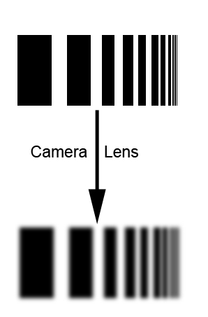
Notice that when the image passes through the lens, it is rendered blurry–there is a decrease in edge contrast and overall contrast. However, the decrease is not equal: finer lines are affected more. The density of the lines depicted is commonly measured in line pairs per mm (lp/mm). One can infer then, that the higher the contrast that a lens yields for a given lp/mm, the better it is. Indeed, just such an objective measure of lens performance is so commonly used that it has been given a name–the Modulation Transfer Function (or MTF), shown below.
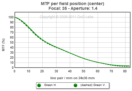
On this chart, the y-axis represents contrast and the x-axis, lp/mm. As we would expect, there is an inverse relationship between contrast and lp/mm. As an aside, note that the area under the curve (i.e. the integral) of the MTF would be maximized in the case of a perfect lens, where said lens is one whose resolution is limited by one and only one parameter–diffraction (hyperlnk to article on diffraction here).
Camera manufacturers usually present MTF charts differently from the one above. Usually, measurements of contrast are conducted at both 10 lp/mm and 30 lp/mm and plotted vs. the distance (in millimeters) from the center of the frame–larger numbers (those to the right) are further away from the center of the lens. Be advised that MTF charts are most useful when used to evaluate lenses of similar focal lengths and/or ranges within a camera manufacturer, one; comparing them across manufacturers is not recommended. As stated previously, the y-axis is a measure of the contrast of the lens, with values below 0.6 being poor, between 0.6-0.8 average, and above 0.8 excellent. We shall consider first the Canon MTF charts and subsequently those of Nikon.
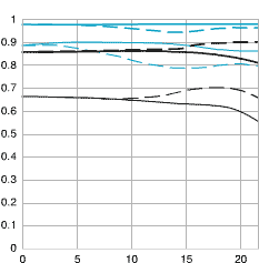
Notice that there are four different pairs of lines plotted–a thick, solid blue and black line pair, a thin, solid blue and black line pair, thick dashed blue and black line pair, and a thin dashed blue and black line pair. So what do each of these lines tell you? The black lines and blue lines are measurements of the lens’ performance wide-open and at f/8, respectively. The thick lines are measurements obtained at 10 lp/mm and serve as a measure of how much contrast a lens is capable of delivering–the higher the line is, the better. The thin lines are derived from measurements at 30 lp/mm and are a measure of the resolving power of the lens–the higher the line is, the greater the perceived sharpness will be. And what of the dashed lines? Well, the more closely a dashed line of a particular color and thickness is aligned with its solid counterpart, the more pleasing will be the rendition of bokeh (out-of-focus elements) in the picture. Notice that all the lines usually exhibit significant drop-off toward the periphery–the edge micro-contrast/ resolution of a lens is always lower than that at the center.
Based on the above information, we can rightly see why EF 135mm f/2L USM lens, widely regarded to have among the highest sharpness and contrast rendition in its class–notice how closely the dashed lines follow their solid counterparts and the relatively low corner-softness/drop-off in comparison the the EFS 18-135 IS zoom telephoto.
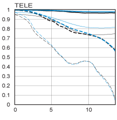
The typical Nikon MTF Chart
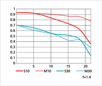
As with Canon’s MTF charts, in Nikon’s MTF chart, the horizontal axis is denominated in millimeters and depicts the distance from the center of the lens to the periphery, while the vertical axis is a measure of contrast. Nikon’s literature on its MTF charts indicates that “The path of 10 lines/mm indicates the contrast reproducibility of the lens (the higher and straighter is better). The higher and straighter the 30 lines/mm-path is, the higher the resolution of the lens.”
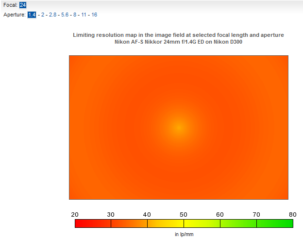
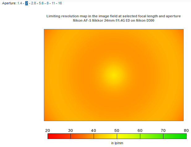
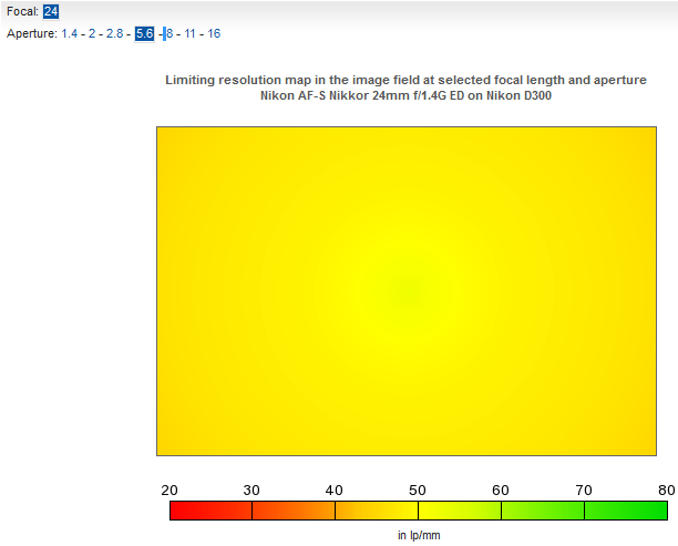
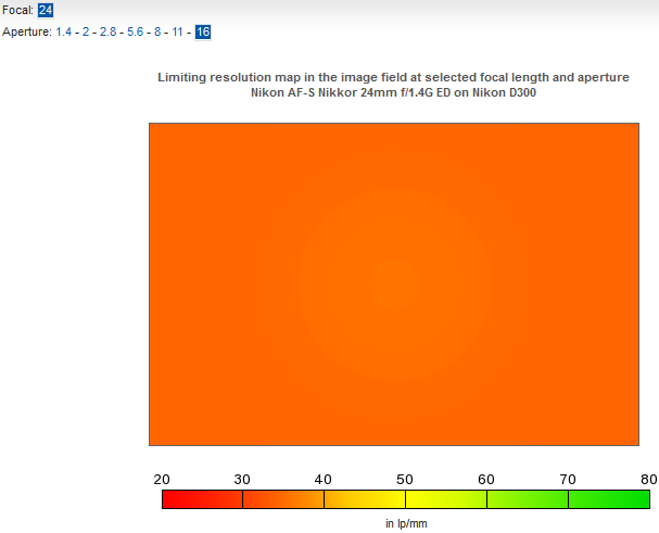
The chart above is the MTF at f/1.4 of the estimable AF-S Nikkor 24mm f/1.4G ED, a $2000 lens widely regarded by many as one of the best 24mm lenses in production currently. Note, however, that wide open, it exhibits significant fall-offs in both contrast and resolution at the corners. This is to be expected, since most lenses are softer wide open than they are stopped down a notch or two. If we consider DxoMark’s map of resolution over the area of the lens at f/1.4 (http://www.dxomark.com/index.php/Lenses/Camera-Lens-Database/Nikon/AF-S-Nikkor-24mm-F-1.4G-ED#div1anchor), we can see that it is quite soft everywhere. At f/2.0, we begin to see improvement. At f/5.6, the lens is quite stellar across the field. And above f/8, diffraction limits resolution (for more on diffraction, see the article on diffraction link).
Conclusion
There is no denying the utility of the MTF chart. However, other determinants of lens performance such as color accuracy, autofocus speed, image stabilization, flare-reduction etc. are not assessed by an MTF plot. There is simply no substitute to running a prospective lens through its paces and subjectively gauging image quality either on-screen or in print.
Further Information
For further information on the MTF chart, I suggest you read Luminous Landscape’s article at the link below http://www.luminous-landscape.com/tutorials/understanding-series/understanding-mtf.shtml. As with their coverage of photography in general, this article is quite well written and informative.
Also, for in-depth, objective, technical analysis of cameras and lenses, DxoMark is a great resource (http://www.dxomark.com).